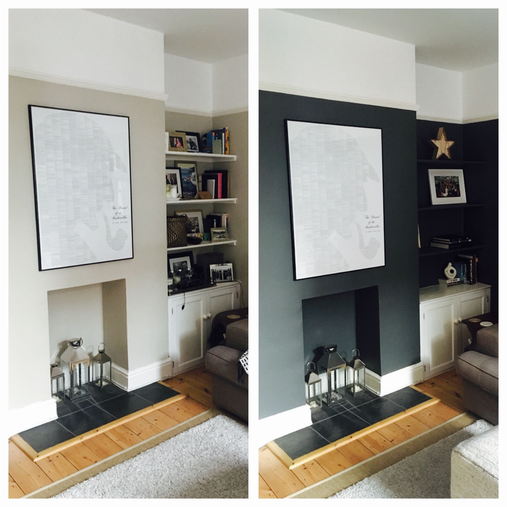
My living room is not large. Cosy, in estate agent lingo. Bijou, should one be feeling generous. Plus it’s north-facing. So what did I do? Paint all the walls a very dark shade of grey.
It’s a totally legit interior design move, apparently. Farrow & Ball, purveyors of the spenny paint, say forget the old rules and paint cold, north-facing rooms in deep colours. Embrace the darkness.
Armed with this advice, I pitched Project Downpipe to The Husband. He agreed in theory. Liked the proposed colour, Downpipe by the aforementioned Farrow & Ball. Did not like the predicted expenditure.So we entered an extensive research phase, that led us to B&Q and tester pots. Two pots later – one Farrow & Ball Estate Emulsion, one Valspar Matt Finish (using the Colour Matching Service) – and we started to paint.
First coat – Farrow & Ball with roller (above left), Farrow & Ball with brush (above) and Valspar with roller (below)
But dry, it’s a different story. After the first coat I preferred the F&B. The finish looked a little smoother, the tone a little richer. And the colours were not matched. The Valspar was a touch darker, with a definite blue undertone whereas the F&B leaned green.
The second coat was a total game changer. With two coats on and dry, the colours became virtually identical: dark grey with blue undertones. Both deep, both rich. The quality of finish too, the same chalky matt. But one tester pot was empty and the other was barely touched. No prizes for guessing which was which my painting pals.So we went with the Valspar. Chose the Valspar Premium Blend v700 Walls & Ceilings in Matt, colour matched to Farrow & Ball in Downpipe. £45 for 5 litres which did the whole room, two coats.
Welcome to the dark side.Til next time,
Hayley
x

Just stumbled across your blog looking for a ‘downpipe’ dupe! Looks like you did the hard work for me! Out of interest what of you take with you for a colour match e.g. the f&b sample pot? thanks in advance, Karen x
Author
Hi! I just took the paint chart, they match it from that tiny square, amazing. I’m still really pleased with the results. Happy decorating! H x
Hello Hayley, I have just read your blog with interest, I have a similar north facing room and went for the Valspar “downpipes”. I’m not happy with it but if you say the second coat makes a difference then I will continue. thanks for the tip. regards Greta
Author
Hi Greta! Yes, I thought it looked much better with two coats, carry on, I’m sure it will look fantastic. Let me know! H x
Would it not be better to colour match from the actual FandB tester pot? Their colour chart is notoriously off I think? But maybe downpipe is one that isn’t? Interested to hear what you think. We want to paint our bathroom in downpipe and after using valspar in our sitting room(blue fedora) I’m keen to cut costs again!
Author
Louise, I didn’t know that about the F&B colour chart! Interesting. That could be a good way to go then. Sometimes I think that the Valspar pulls more blue than the F&B downpipe, but it definitely does have the green shift depending on the light. So has that depth of colour. I’m still delighted with it. Let me know what you decide! H x
Sorry only just seen your reply! I still haven’t decided but am now in possession of a F&B tester pot. I did read somewhere that you can colour match a tester pot of valspar to try and that they give you a match percentage? I think I may try that this week!
Author
And you can get a colour matched tester pot from Valspar, so you could try big swatches of both on the walls. H x
Hi Hayley, A great read. I’m keen to find out the white emulsion you chose to to marry with the Valspar? Many Thanks. MJ
Author
Hi MJ, we didn’t actually refresh the white so I don’t know I’m afraid! Thank you for reading. H x
Hello Hayley. Out of interest, what was the previous wall colour brand/shade you painted over please (if you remember), which also worked well (for for my purposes potentially, though love your new finish:). Many thanks, G
Author
Hi Geoff, I don’t know I’m afraid as that was the colour when we moved in. Thanks for reading! H
Hi Hayley – jumping on your old post – looks great. Can I ask what colour you have on the ceiling? Is it an off white rather than a bright white? Thanks.
Author
Hi Jenny, not sure of the exact shade but the ceiling is a bright white and the picture rail, door frame and skirting are off white. Hope that helps! Hayley
Hi Hayley, did you get the Valspar colour code from B&Q? I know it usually comes up on their computer it might be printed on the tin.
Just thought about asking for a sample pot in that colour code.
Oh I would love the colour code please? Thank you in advance
Oh yes please, that would be soooo handy
X
You can just ask at the mixing desk for the Farrow and Ball colour and they will make it for you – you don’t need a code.